
Introduction
Walk into any room and your body registers it before your eyes finish scanning the walls. The warmth of a wood floor underfoot, the give of a wool rug, the cool flatness of a marble counter: these sensations shape how a space feels long before style or color enter the conversation.
Many interiors are designed to photograph well but feel wrong in person. A sofa looks plush in a catalog and turns out scratchy against skin. A floor tile reads warm in a rendering but feels icy at 6 a.m.
Tactile texture is the physical quality of a surface: what you actually feel when you touch it. It affects comfort, usability, and how safe or overstimulated a space makes someone feel.
This guide covers tactile texture examples, how to layer materials intentionally, and why sensory preferences vary from person to person. You will also learn how to choose finishes that hold up to real life, with neuroinclusive design considerations for sensory-sensitive users.
Key Takeaways
- Tactile texture is felt through touch; visual texture is judged by sight alone.
- Match texture to the room’s purpose and the user’s real sensory preferences.
- Too much texture (or the wrong kind) creates discomfort, not luxury.
- Test samples in person and factor in maintenance before you commit.
- Layer materials gradually rather than introducing everything at once.
What Is Tactile Texture in Interior Design?
Tactile texture refers to qualities you can physically feel: softness, roughness, smoothness, temperature, weight, flexibility, and pile height. A bouclé throw feels different in your hands than a linen one, even if both look similar from across the room.
Tactile vs. Visual Texture
One you feel; the other you only see:
- Tactile texture — a genuinely nubby, woven fabric with raised loops you can feel
- Visual texture — a wallpaper printed to look raised or woven, but flat to the touch
A room can be full of visual texture and still feel sensory-flat. Conversely, a fairly minimal room can feel rich if the few materials present are chosen with real tactile intention.
How Texture Interacts With Other Design Elements
Texture isn't the same as pattern, color, or finish, but the four work together. A rough, dark wood beam reads rustic and grounded. That same wood, sanded smooth and painted white, reads clean and modern. Same material, different tactile story.
Texture can influence how warm, intimate, formal, or spacious a room feels. But those responses aren't universal.
A plush velvet chair might feel calming to one person and genuinely unpleasant to someone with tactile sensitivity to pile fabrics. There's no single correct texture palette. The right mix is the one that fits the people using the space.

Why Tactile Texture Matters in Sensory-Aware Design
Tactile choices affect more than aesthetics. When materials align with a person's sensory preferences, they support comfort, a sense of orientation, and, critically, a sense of control over the environment.
This connects directly to neuroinclusive design. A 2021 scoping review of built-environment research for autistic individuals found that sensory quality, intelligibility, and predictability can meaningfully shape quality of life (Tola et al., 2021). Responses to texture and touch also vary widely from person to person.
The practical implication is clear: environments should accommodate different sensory thresholds instead of assuming one comfortable palette works for everyone.
A more recent literature review identified over 80 sensory-informed design qualities, including material suitability and zoning that supports reduced stimulation. It also notes that the sensory impact of these qualities on individuals still needs more direct study (Al-Harasis et al., 2025).

Texture doesn't work in isolation. Sensory-aware design considers the whole environment together:
- Lighting and glare
- Acoustics and background noise
- Temperature
- Visual contrast and clutter
- Circulation and personal space
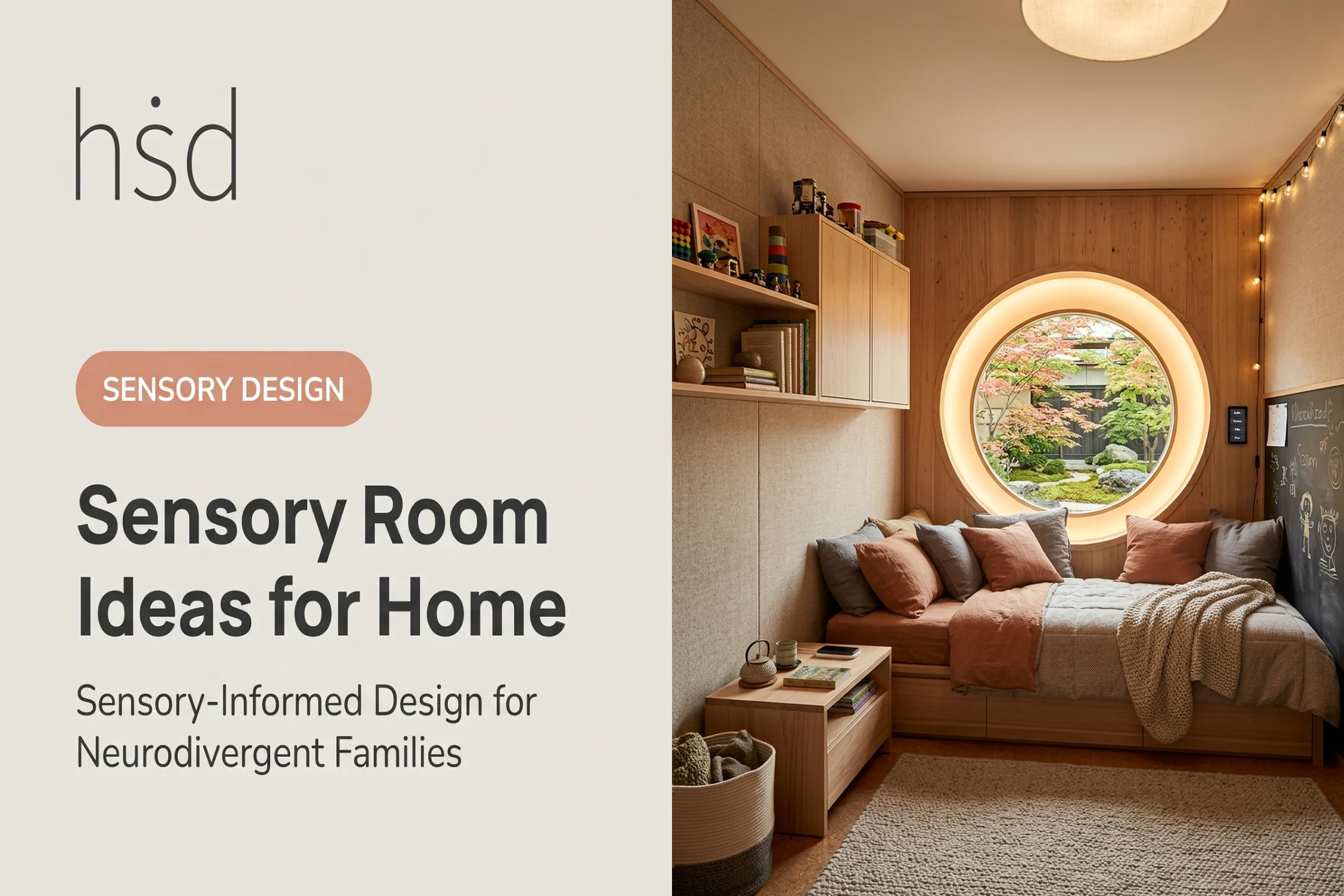
A practical example: in one home, a bedroom retreat might use soft, washable bedding and a low-pile rug for barefoot comfort. Down the hall, a home office or study nook might deliberately avoid scratchy textures, highly irregular surfaces, or busy visual patterns that compete for attention during focused work.
No material is a guaranteed therapeutic fix. Texture is one lever among lighting, sound, and layout—and matching it to each room's job is still one of the most overlooked moves in interior design.
Tactile Texture Examples for Interior Design
Grouping materials by the sensation they create makes it easier to build an intentional palette—especially in sensory-aware interiors—rather than grabbing whatever looks trendy.
Soft, Woven, and Compressible Textiles
- Cotton — breathable and durable, with high moisture absorbency that stays comfortable in warm rooms
- Linen — strong and temperature-regulating, with a dry hand; wrinkles easily and often needs careful washing or dry cleaning
- Wool — springy and insulating; Merino is notably odor-resistant and less prone to holding surface stains
- Velvet — short cut pile with a smooth, soft hand; confirm fiber content and cleaning code before high-use upholstery
- Bouclé — uneven, looped yarn with a nubby, texture-forward feel; check snag resistance on high-traffic pieces
- Chenille and corduroy — soft pile constructions; denser weaves generally wear better in daily-use seating
Hard and Structured Materials
- Wood — warm and varied in grain; it gains or loses moisture with humidity, which changes feel and movement over time
- Natural stone — cool and solid underhand; use neutral cleaners only—acids can etch, and abrasives can scratch
- Leather — aniline feels softer and absorbs liquids readily; pigmented leather cleans more easily and holds up better to wear
- Cork — offers thermal and acoustic softness underfoot, plus a naturally springy give
- Glass and metal — cool, smooth, and reflective; use tempered glass where impact or partition safety matters
Lower-Commitment Applications
You don't need to renovate to introduce texture. Cushions, throws, rugs, baskets, curtains, and hardware let you test tactile choices before committing to furniture or flooring.
Plants add organic, irregular texture too—if allergies, pets, and upkeep realistically fit the room.
Appearance doesn't reliably predict feel. A matte finish can feel rougher than a glossy one, and a surface that looks smooth in photos may feel gritty in person. For sensory-sensitive households, sample materials at real room temperature and lighting, then touch before you commit.
How to Use Tactile Texture Thoughtfully in a Space
Building a tactile palette works best as a sequence, not a shopping trip.
- Start with the user and the room. Who uses this space, what happens here, and which surfaces get touched most — armrests, countertops, flooring near the entry?
- Build a sensory brief. Note preferred and disliked textures, temperature preferences, cleaning needs, durability requirements, and any known sensitivities.
- Choose a controlled palette. Pick one dominant texture, one or two supporting textures, and a small number of contrasting accents. Random variety without purpose creates visual and sensory noise.
- Layer across scales. A soft seating surface, a woven rug, a smooth tabletop, and a restrained wall finish work together — while keeping walkways and functional surfaces clear.
- Test physical samples in the actual room. Materials feel different under room lighting and at the spots where people sit, walk, or lean. Check how each one holds up to wear, cleaning, humidity, and sun.

Families without a design background do not have to guess their way through these choices. A sensory-focused consultation with Highly Sensitive Design can turn a household's sensory profile, daily routines, and support needs into clear material and layout recommendations.
Choosing Materials by Room, Function, and Sensory Need
Different rooms carry different tactile priorities.
| Space | Priority | Notes |
|---|---|---|
| Bedrooms & retreat areas | Breathable, predictable, easy-to-control | Soft underfoot transitions; avoid assuming one fiber works for everyone |
| Living rooms & family spaces | Comfort + durability | Upholstery and rugs need to withstand heavy daily use without sacrificing feel |
| Kitchens, bathrooms, entryways | Grip, moisture resistance, hygiene | Prioritize function over decorative texture alone |
| Home offices, classrooms, clinics | Predictability, low distraction | Materials shouldn't compete with the room's primary task |
Wet-area flooring deserves particular care. The ADA requires accessible floor and ground surfaces to be stable, firm, and slip-resistant. It sets no minimum slip-resistance number, so a product claiming "ADA compliant" based on a generic slip rating alone should raise questions (Access Board, ADA Chapter 3).
Material needs also shift by user. Children, adults, highly sensitive individuals, and people with mobility needs often want different things from the same room. Highly Sensitive Design's process typically begins with a detailed survey covering routines, preferences, and goals. Direct input from the actual user beats assumptions every time.
Common Mistakes to Avoid
Most texture missteps come from designing for the photo, not the person living in the room. Watch for these patterns:
- Assuming more texture equals more luxury. Excessive contrast or competing surfaces often reduce calm rather than adding it.
- Choosing materials from photos alone. Trend boards can't convey temperature, glare, sound, or how a fabric ages after six months of use.
- Ignoring daily-use realities. Scratchy, shedding, or hard-to-clean surfaces cause real friction if they don't match someone's sensory profile and routine.
- Calling texture universally therapeutic. No fabric or finish is a guaranteed calming solution — design supports regulation; it doesn't replace clinical care.
- Skipping product-specific research. Sustainability certifications, emissions data, and fire-safety ratings vary by product and version — verify before making claims.
Frequently Asked Questions
What is tactile texture in interior design?
Tactile texture is the physical quality of a surface that you can feel through touch, such as the nap of velvet, the grain of wood, the coolness of stone, or the give of a woven rug.
What are examples of tactile texture?
Common examples span textiles (wool, linen, leather), flooring and walls (wood, stone, textured plaster), and accessories (baskets, ribbed cushions, woven throws).
How is tactile texture different from visual texture?
Tactile texture is physically felt, while visual texture is only suggested through pattern, color, or surface appearance, without any actual change in feel.
How do I choose textures for someone with sensory sensitivities?
Ask the person directly, test physical samples in context, layer new textures gradually, and stick to predictable materials. Also weigh cleaning needs, temperature, and acoustics alongside touch.
How many different textures should a room have?
There's no universal number. Base the count on the room's purpose, the occupants' sensory preferences, visual balance, and how easy the materials are to maintain.